


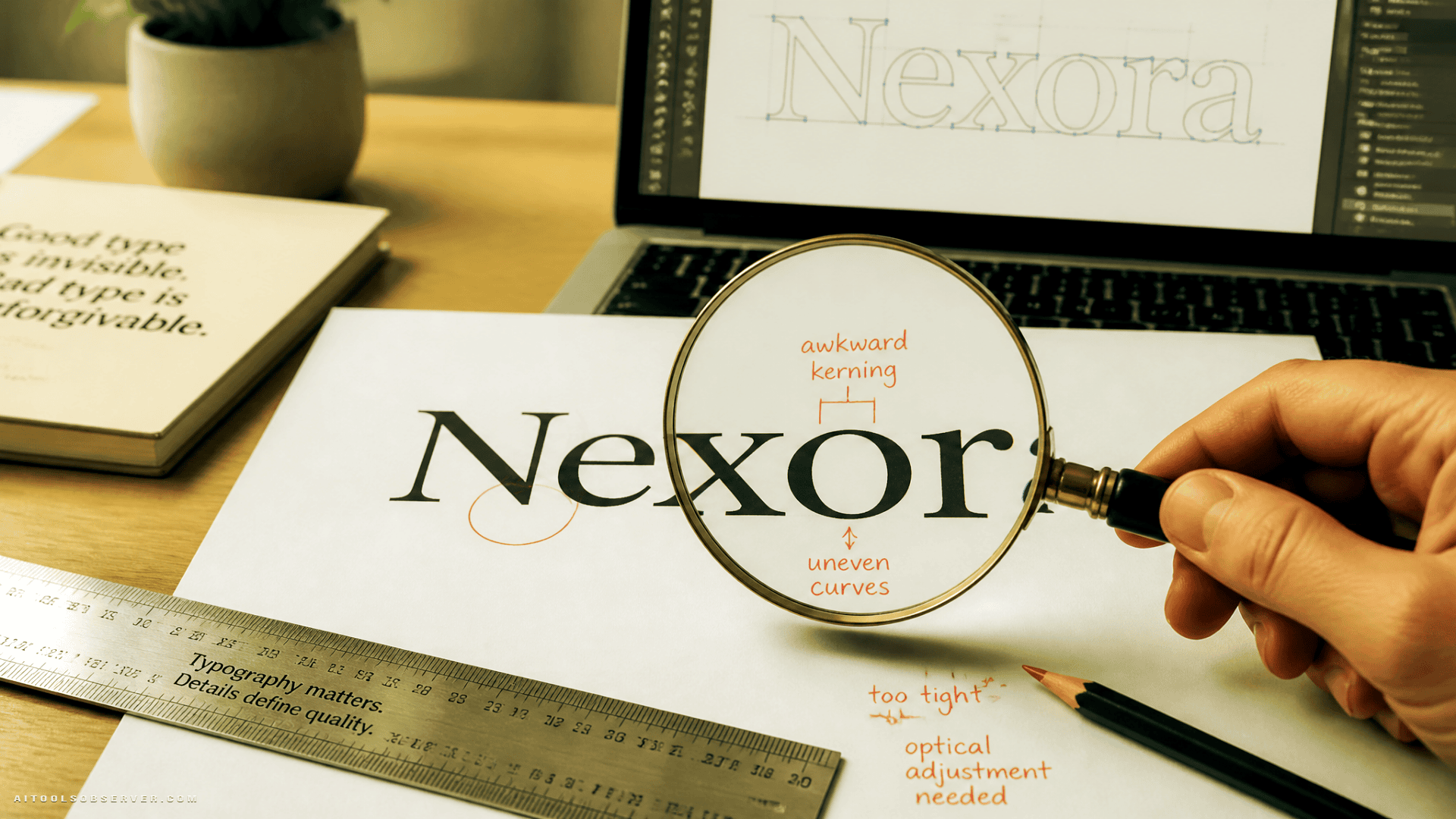
“Why Does It Say Instagzam?”
That was the first reaction from a lot of designers and casual observers alike. The new wordmark’s ‘r’ reads closer to a ‘z,’ the kerning around the ‘g’ feels unsettled, and the ‘s’ — meant as a nod to the old cursive logo — looks like it wandered in from a different typeface entirely.
The previous wordmark was simple cursive. Dated, maybe. But it was legible, consistent, and did exactly what a wordmark is supposed to do: communicate the brand name clearly at a glance.
The new version fails that basic test.
The AI Slop Comparison Is the Interesting Part
Nobody is seriously claiming Instagram’s design team used generative AI to produce the logo. That’s not the point. The point is that it looks like AI-generated text — the kind of almost-but-not-quite lettering that comes out of image generators when they try to render words and get the shapes slightly wrong.
That’s a new and specific aesthetic failure mode. A year ago, you couldn’t describe a logo as “looking like AI slop” because the reference point didn’t exist in mainstream visual culture. Now it does.
When a human-designed logo triggers that association, it signals something has gone wrong at the legibility and identity level — even if the process was entirely manual.
What This Reveals About Branding in the Generative AI Era
This redesign is a useful case study for anyone thinking about visual identity right now, for a few reasons.
The AI slop aesthetic is now a recognized failure category. Audiences have been trained — through exposure to millions of AI-generated images — to spot text that looks slightly wrong. That pattern recognition is now being applied to real brand design. If your logo triggers that association, you have a perception problem regardless of how it was made.
“Modern” and “legible” are not the same thing. The new Instagram wordmark does feel more contemporary than the old cursive. But contemporary doesn’t automatically mean effective. A logo has to function as a piece of communication first. Style is secondary.
Backlash travels fast when the failure is visual. Unlike a policy change or a feature removal, a logo redesign is immediately visible to every user. There’s no onboarding, no explanation, no context. People see it and react. If the reaction is “that looks broken,” you’ve already lost the first impression.
The Unintentional Genius Angle
Here’s the uncomfortable flip side: as a symbol of the current moment in tech and design, the Instagram wordmark might actually be accidentally perfect.
We’re in an era where AI-generated content is flooding every visual channel. The line between “human-made” and “machine-made” is blurring in ways that are genuinely hard to track. A major platform’s logo looking like AI slop — whether or not it actually is — captures something real about where we are.
That’s not a defense of the design. It’s an observation about what the backlash is really pointing at.
What Founders and Marketers Should Take Away
If you’re building a brand, product, or tool right now — especially in the AI space — this redesign is worth paying attention to.
- Legibility is non-negotiable. If users have to decode your logo or wordmark, you’ve already created friction.
- The AI slop association is a real reputational risk. Anything that looks generically “AI-ish” — in design, copy, or visuals — is increasingly read as low-effort or untrustworthy.
- Audience pattern recognition has shifted. People are more visually literate about AI artifacts than they were 18 months ago. Design decisions that might have passed unnoticed before are now getting flagged immediately.
The Instagram redesign didn’t fail because it used AI. It failed because it looks like it did — and in 2026, that’s a distinction that matters less and less.




Comments (0) No comments yet
Want to join this discussion? Login or Register.
No comments yet. Be the first to share your thoughts!